

In this field
Self-initiated concept exploration. Not a commissioned client project.
The question.
How can one identity stay coherent across an expressive launch, a useful website and the everyday details of a digital product? Parallel explores the rules that make a brand recognisable even when its form changes.
The direction.
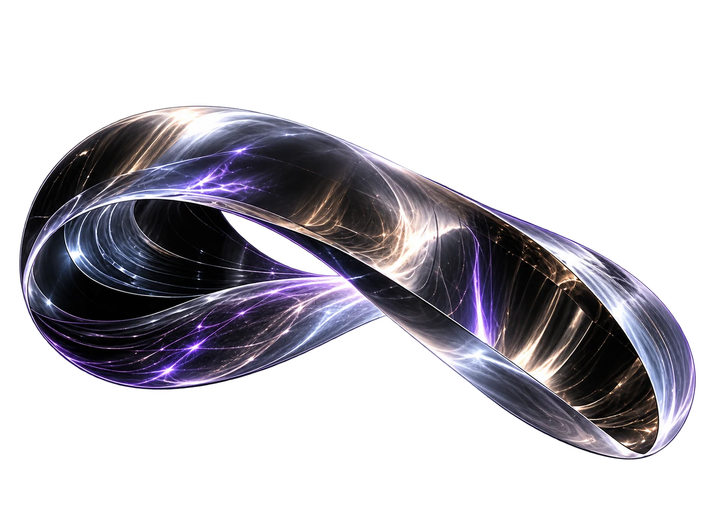
A continuous metallic fold travels through different dimensions while remaining one object. That image becomes a creative principle: a shared identity expressed in ways that suit each context. Typography, spacing, image treatment and motion establish continuity.
Designed as a system.
The concept connects an initial brand idea to a digital design language. An expressive opening gives way to clearer, quieter surfaces where people need to read, choose or complete a task. Motion supports a change of state rather than filling every moment.
Scope explored.
- Positioning and a core creative idea.
- Visual identity, typography and art direction.
- A flexible website and interaction language.
- Motion principles and reusable image assets.
What would come next.
A real commission would begin with audience research and a positioning workshop. The identity would then be tested in the touchpoints that matter most, documented and prepared for the team that will use it.
Recognition through variation.
The folded object changes silhouette while keeping its material and continuous structure. A brand system can behave in the same way: distinctive in a launch, quieter in a form, still unmistakably related.
Guidance for the next team.
An identity becomes useful when people can apply it. The production scope would include asset preparation, practical usage rules, accessible combinations and examples of the everyday decisions the team needs to make.